Quartz Countertop Colors That Work Best With White, Wood, and Dark Cabinets
Quartz countertop color is one of the choices that can either bring a kitchen together or make every other finish feel slightly off. A slab may look attractive by itself, but the real test is how it works beside the cabinets, flooring, backsplash, wall color, hardware, and natural light in the room.
That is why the best quartz choice is rarely just white, gray, or marble-look. A countertop has undertones, movement, contrast, scale, and surface personality. The same sample can look clean beside one cabinet door and too cold, too yellow, or too busy beside another. Before choosing a slab, start with the cabinet color family and build the rest of the palette around it.
The right quartz color does more than match the cabinets; it gives the kitchen balance, warmth, and a clear design direction.
Start With the Cabinets, Not the Countertop
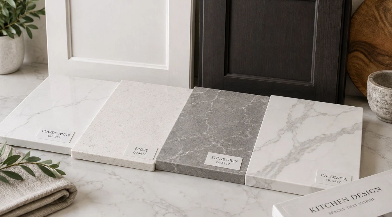
Cabinets take up more vertical space than the countertop, so they strongly influence how the quartz color reads. White cabinets reflect light and can make a kitchen feel brighter, but they also expose small undertone differences. Wood cabinets add warmth and grain, which can soften the room or clash with the wrong gray. Dark cabinets create drama, but they usually need enough contrast so the kitchen does not feel heavy.
A good showroom comparison should include an actual cabinet door or finish sample whenever possible. Photos on a phone are useful, but a physical sample shows color, sheen, and texture more honestly. Place the cabinet sample flat against the quartz, then stand it upright the way it will appear in the room. Both views matter because counters and cabinet faces catch light differently.
White Cabinets: Clean, Bright, and Easy to Misjudge
White cabinets are flexible, but they are not automatically neutral. Some are warm and creamy. Some are cool and crisp. Some painted whites have gray, yellow, pink, or green undertones that only become obvious when they are placed beside another light surface.
For warm white cabinets, quartz with soft cream, beige, warm gray, or subtle taupe movement often feels more natural than a sharp blue-white slab. For cooler white cabinets, a cleaner white quartz with gray veining can look crisp and intentional. The biggest mistake is choosing a countertop that is almost the same white as the cabinets but not quite. That small mismatch can make one surface look dirty or unfinished.
Best Quartz Looks for White Cabinets
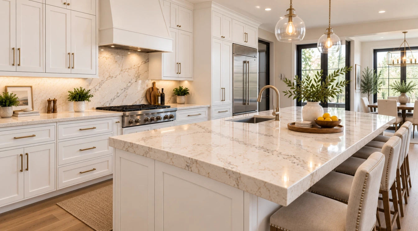
White cabinetry can support several quartz directions, but each creates a different effect. A quiet warm-white quartz gives the room a calm, continuous look. A Calacatta-style quartz with bold veining creates a focal point, especially on an island. A soft gray-veined quartz feels polished without becoming too dramatic. A beige or greige quartz warms the kitchen and can connect nicely with wood floors.
- Soft white quartz: best when the kitchen needs a clean, simple background.
- Calacatta-style quartz: best for islands, waterfall edges, and kitchens that need a stronger focal point.
- Warm beige or greige quartz: best when white cabinets need warmth from the countertop.
- Light gray quartz: best with cooler whites, stainless appliances, and modern finishes.
- Dark quartz: best when the kitchen has enough light and the goal is deliberate contrast.
If the backsplash will also be light, avoid letting the counter, cabinets, and tile become three slightly different whites. That usually looks accidental. One surface should lead, and the others should support it.
Wood Cabinets: Let the Countertop Balance the Warmth
Wood cabinets bring natural variation, grain, and depth into the kitchen. Because the cabinetry already has visual movement, the countertop usually needs more restraint. That does not mean the quartz must be plain, but its pattern should not fight the wood grain.
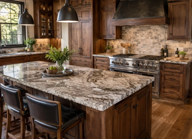
White oak, natural maple, walnut, cherry, alder, and espresso-stained wood all behave differently. Light oak often pairs well with warm white, cream, pale greige, or soft taupe quartz. Walnut can look excellent with creamy marble-look quartz, muted beige, charcoal, or soft white designs. Reddish woods are more sensitive; cool gray quartz can make them look orange, while warmer neutrals usually feel more balanced.
Best Quartz Looks for Natural and Stained Wood Cabinets
For light wood cabinets, quartz with a warm base and gentle movement usually works best. A bright, cool white countertop can look disconnected unless the rest of the room has equally crisp finishes. A soft stone-inspired pattern, especially one with warm gray or beige veining, often feels more complete.
For medium and dark wood cabinets, lighter quartz can keep the room from feeling closed in. A white or cream slab with subtle veining adds contrast while keeping the focus on the cabinet grain. In a larger kitchen, darker quartz can work on a perimeter counter, bar, or secondary surface, but it needs careful lighting and contrast around it.
The right quartz color does more than match the cabinets; it gives the kitchen balance, warmth, and a clear design direction.
Dark Cabinets: Contrast Is Usually the Key
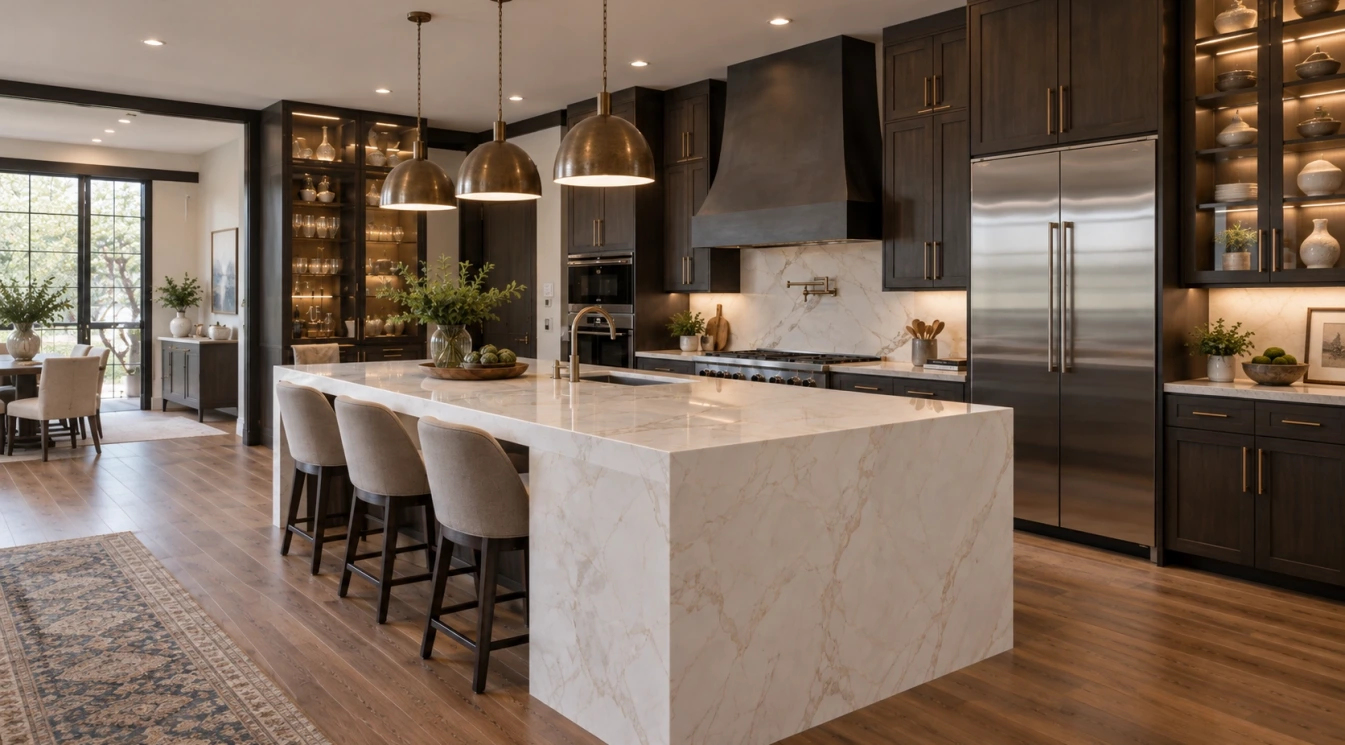
Dark cabinets can make a kitchen feel rich and architectural, but the countertop has to keep the room from becoming too visually heavy. Black, espresso, charcoal, navy, dark green, and deep brown cabinetry usually benefit from a quartz surface that brings light back into the space.
Warm white quartz, creamy marble-look quartz, pale gray quartz, and quartz with gold or taupe veining can work well. A dark countertop on dark cabinets is possible, but it creates a more specific mood. That look needs strong lighting, enough floor contrast, and a backsplash that does not disappear into the cabinets.
Hardware also becomes more important with dark cabinetry. Brass, bronze, black, nickel, or stainless finishes can change the way veining reads. A quartz slab with warm gold movement may feel intentional with brass hardware and awkward with cooler silver finishes if the rest of the room is not balanced.
Two-Tone Kitchens Need One Clear Anchor
Many kitchens now combine white upper cabinets with wood or dark lower cabinets, or a contrasting island with quieter perimeter cabinetry. This creates more design opportunity, but it also creates more chances for the countertop to feel disconnected.
If the island is the feature, a stronger quartz pattern can work there while the perimeter stays calmer. If the cabinets already provide strong contrast, the countertop may need to be quieter so the room does not feel crowded. The key is deciding what should be noticed first: the island, the cabinet color, the slab movement, the backsplash, or the overall warmth of the room.
Think About the Backsplash Before You Commit
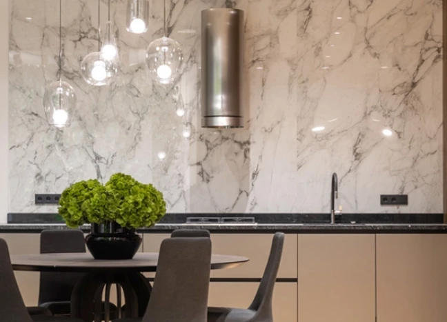
Countertop color cannot be separated from backsplash planning. A bold quartz with large veining often looks best with a simple tile or a full-height slab backsplash using the same material. A subtle quartz can support a handmade-look tile, textured ceramic, soft zellige-style surface, or patterned backsplash more comfortably.
Grout color matters too. High-contrast grout can make the backsplash busier, which may compete with quartz veining. A close grout match gives the counter and backsplash a calmer relationship. In kitchens with white cabinets, grout is often where undertone conflicts become obvious.
Use Lighting to Test the Color Honestly
Quartz samples can look different under showroom lighting, daylight, warm LED bulbs, and evening task lighting. Sacramento homes with large windows may reveal undertones more strongly during the day, while smaller kitchens may rely heavily on artificial light.
Look at the sample flat, upright, near the floor, beside the cabinet door, and next to backsplash options. If the quartz will be used on a large island, remember that a small sample only hints at the full slab pattern. Large-scale veining may look subtle on a chip and much stronger across a wide surface.
Avoid the Most Common Quartz Color Mistakes
One common mistake is choosing a dramatic quartz because it looks impressive by itself, then pairing it with a busy backsplash, active flooring, and detailed cabinets. Another is choosing a very cold white countertop for a home filled with warm wood, beige walls, and cream finishes. A third is assuming all gray quartz is neutral. Some grays lean blue, green, or purple, and those undertones can become obvious after installation.
It also helps to avoid choosing by trend alone. A quartz color should fit the cabinet style, the amount of light, the home’s architecture, and the materials that are likely to stay in place for years. A restrained quartz is not boring if the room has good proportions, quality cabinetry, and a well-selected backsplash.
Bring the Right Samples to the Showroom
The best quartz decision is made with the whole room in mind. Bring cabinet doors, drawer fronts, flooring samples, backsplash ideas, paint colors, appliance finish information, and photos of the kitchen in natural light. If the cabinets are already installed, photos from several angles are helpful.
Domus Surfaces can help Sacramento homeowners compare quartz colors with cabinets, tile, flooring, and other surfaces so the final choice feels intentional rather than isolated. A countertop is one of the most visible materials in the kitchen, and the right color should make the surrounding finishes look better, not compete with them.