Kitchen Countertop and Backsplash Pairings That Actually Work
A kitchen countertop and backsplash are close enough to be read as one design decision, even when they are made from different materials. The countertop sits in the foreground, the backsplash rises directly behind it, and together they create the main surface composition of the kitchen. If they compete, the room feels busy. If they are too similar without truly matching, the room can feel flat or slightly off. When they support each other, cabinets, flooring, hardware, and lighting all make more sense.
The best pairings are not chosen by looking for two impressive materials on their own. They are chosen by deciding which surface should lead and which surface should support. A dramatic quartzite island may need a quieter backsplash. A simple quartz countertop may welcome handmade-look tile, soft texture, or a more detailed pattern. A full-height slab backsplash can look refined, but only when the slab movement, cabinet color, and room size can carry it.
Choose the Lead Surface First
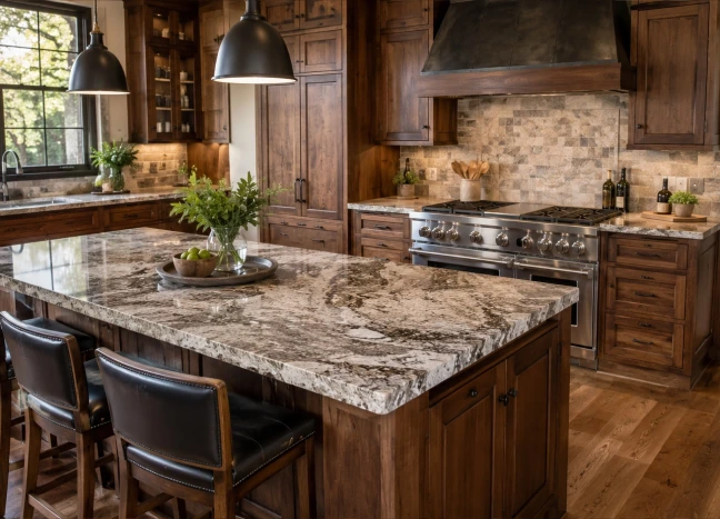
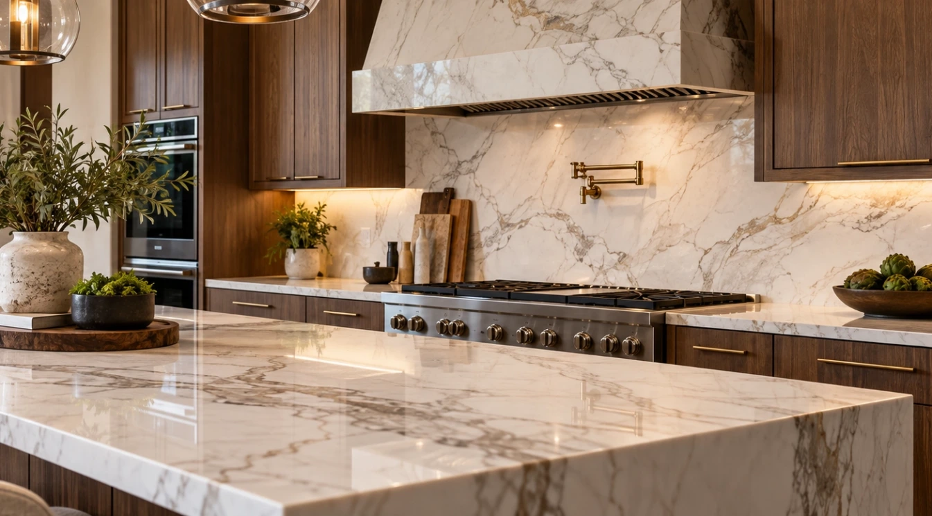
Before comparing tile colors or slab samples, decide what should get attention first. In some kitchens, the countertop is the feature. This is common with bold quartzite, marble-look quartz, dramatic granite, or a waterfall island. In other kitchens, the backsplash is where the personality belongs, especially when the countertop is a quieter white, cream, gray, or warm neutral.
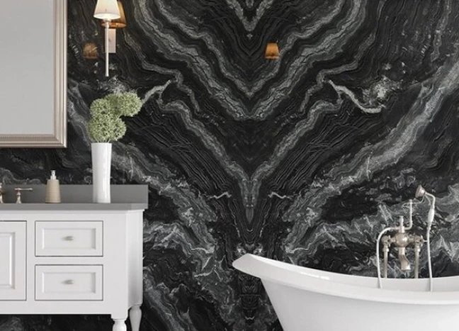
Trying to make both surfaces equally loud is where many kitchens go wrong. A bold veined counter with a patterned backsplash can work in a very deliberate design, but it needs restraint everywhere else. Most homes look better when one surface carries the movement and the other gives it room to breathe.
Bold Countertop, Quiet Backsplash
If the countertop has strong veining, mineral movement, or high contrast, the backsplash usually needs to be simpler. That does not mean the backsplash has to be plain. A quiet backsplash can still have handmade edges, a soft satin finish, subtle texture, or a color that gently repeats one of the tones in the slab.
For example, a quartzite with cream, taupe, and gray movement may pair beautifully with a warm off-white tile, a pale greige ceramic, or a very simple full-height slab. A dramatic black-and-white countertop may work best with a clean white backsplash and low-contrast grout. The goal is to let the counter look intentional rather than surrounded by competing patterns.
Simple Countertop, More Expressive Tile
When the countertop is calm, the backsplash has more freedom. A soft white quartz, honed-look quartz, warm beige surface, or quiet porcelain slab can support tile with texture, color variation, or a more handcrafted feel. This is where zellige-style tile, elongated subway tile, fluted tile, mosaic accents, or a gentle pattern can add character without overwhelming the room.
The key is to keep the color relationship honest. A warm cream counter usually works best with a warm tile. A cooler gray-white counter usually wants a cleaner white, cool gray, blue-gray, or charcoal accent. Mixing a cold counter with a yellow cream tile can make both materials look wrong, even if each one is attractive separately.
Full-Height Slab Backsplash vs Tile Backsplash
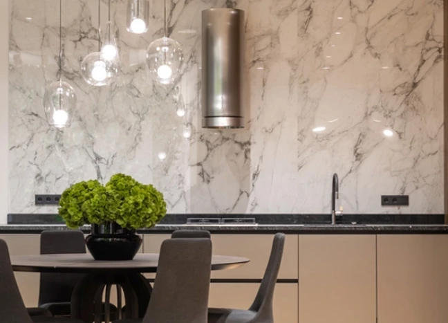
A full-height slab backsplash creates a continuous surface from the counter up the wall. It can look especially polished behind a range, around a hood, or on a wall with open shelving. Slab backsplashes are often chosen when the homeowner wants fewer grout lines, a cleaner visual field, or a more architectural look.
Tile backsplashes give more flexibility. They can add texture, soften a modern kitchen, introduce color, or make a traditional cabinet style feel more detailed. Tile also allows a homeowner to use a quieter countertop and still give the kitchen personality. The better choice depends on the room. A small kitchen with strong slab movement may feel crowded if that same movement runs up every wall. A large kitchen with simple cabinets may benefit from the continuity of a slab backsplash.
Match Undertones Before You Match Colors
Countertop and backsplash colors do not need to match exactly. In fact, exact matching can feel flat unless the design is intentionally minimal. What matters more is undertone. Warm whites, cool whites, taupes, beiges, grays, creams, and blacks all have subtle color direction.
A quartz counter with warm beige veining usually pairs more naturally with cream, ivory, taupe, clay, warm gray, or soft greige tile. A cooler quartz with crisp gray veining usually pairs better with cleaner whites, cooler grays, smoky blues, or charcoal. Natural stone can be even more sensitive because it may contain several undertones at once. Pulling one secondary tone from the slab is often safer than trying to match the background color exactly.
The most elegant kitchen pairings do not compete for attention; they let one material lead while the others give the room depth, warmth, and quiet support.
Grout Can Change the Whole Pairing
Grout is not just a technical detail. It affects how busy the backsplash feels. A white tile with dark grout creates a clear grid. That can look sharp in the right kitchen, but it may fight a heavily veined countertop. A close grout match creates a calmer surface and lets the countertop remain the focus.
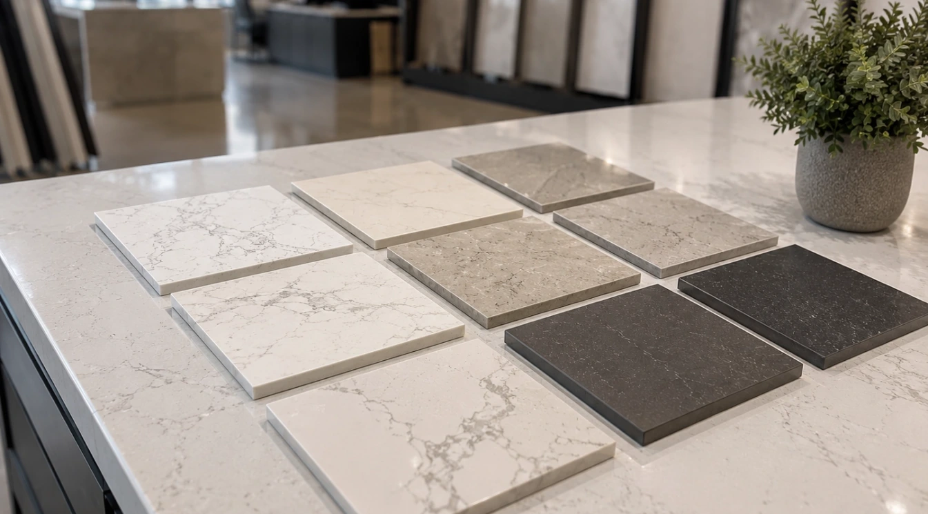
With handmade-look tile or tile that has natural variation, grout color becomes even more important. A grout that is too bright can make the tile edges look harsh. A grout that is too dark can make the wall pattern stronger than expected. The safest approach is to view tile and grout samples next to the countertop before deciding.
How Cabinet Color Affects the Pairing
White cabinets can make undertone conflicts more obvious because every surface is compared against a light background. With white cabinets, avoid combining too many different whites unless one is clearly warmer or deeper by design. A soft quartz counter, simple tile, and carefully selected grout can keep the kitchen clean without making it sterile.
Wood cabinets usually need countertop and backsplash materials that respect the cabinet warmth. White oak, walnut, maple, cherry, and darker stains all change the surface palette. With wood cabinets, a backsplash that repeats the counter’s warmth can make the design feel settled. Very cool gray tile can look disconnected beside warm wood unless the countertop helps bridge the two.
Dark cabinets often benefit from contrast. A lighter counter and backsplash can keep the room open, while a darker slab or tile can create a moodier kitchen. If the cabinets, countertop, and backsplash are all dark, the lighting plan has to be strong enough to keep the space from feeling closed in.
Pairings That Usually Work Well
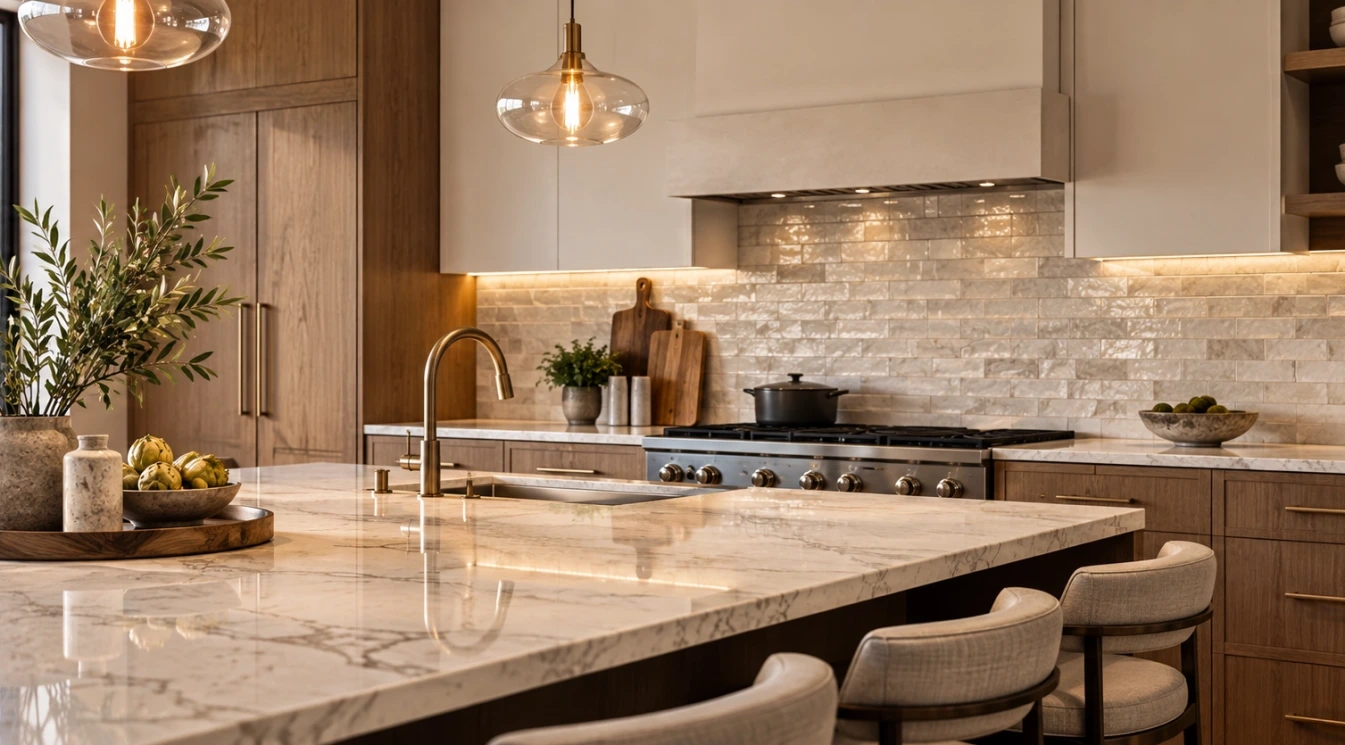
Some combinations are reliable because they solve common design problems. A marble-look quartz countertop with a quiet warm-white tile keeps the kitchen bright while avoiding too much pattern. A quartzite countertop with a handmade neutral tile can feel natural and layered. A dark quartz counter with a light vertical tile backsplash can add contrast without making the room feel heavy.
- Bold quartzite with simple ceramic tile: best when the countertop should be the feature.
- Soft white quartz with textured tile: best when the kitchen needs warmth and detail.
- Warm neutral countertop with ivory or greige tile: best for wood cabinets and softer palettes.
- Dark countertop with light backsplash: best when contrast is needed without darkening the whole room.
- Full-height slab backsplash with simple cabinets: best when the goal is a clean, architectural surface.
Pairings to Be Careful With
There are no universal rules, but some combinations need extra caution. A busy countertop with a busy backsplash can make the kitchen feel restless. A cold gray counter with cream tile can make the tile look yellow and the counter look blue. A strong patterned tile behind a heavily veined slab may pull attention away from the material that was supposed to be the focal point.
Also be careful with online inspiration photos. Many are photographed in perfect lighting, edited for contrast, or shown in homes with different cabinet colors and floor tones. A pairing that looks excellent in one kitchen can look wrong in another because the surrounding materials are different.
Think Beyond the First Impression
A good kitchen pairing should still feel comfortable after the first week. Dramatic materials can be beautiful, but they should not make the room feel visually tiring. Quiet materials can be practical, but they should not make the kitchen feel unfinished. The best balance depends on how the space is used, how much natural light it receives, and which parts of the kitchen are meant to stand out.
For Sacramento homeowners comparing countertops, slabs, tile, flooring, and cabinets, Domus Surfaces can help the materials be viewed together instead of chosen one at a time. That matters because the final kitchen is not a collection of separate products. It is one room, and every visible surface affects the next one.