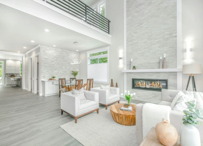
Warm Neutral Countertops: Colors That Make Kitchens Feel More Inviting
Warm neutral countertops can make a kitchen feel comfortable, polished, and naturally connected to the rest of the home. Instead of relying on a stark white or a cool gray surface, warm neutrals introduce subtle tones of cream, sand, beige, taupe, soft greige, and warm white.
These colors are versatile because they can support many cabinet styles without making the room feel flat. They work with natural wood, painted cabinetry, textured tile, brass or black hardware, and both traditional and contemporary interiors. The key is choosing the right undertone and balancing it with the other fixed materials in the room.
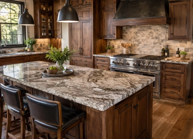
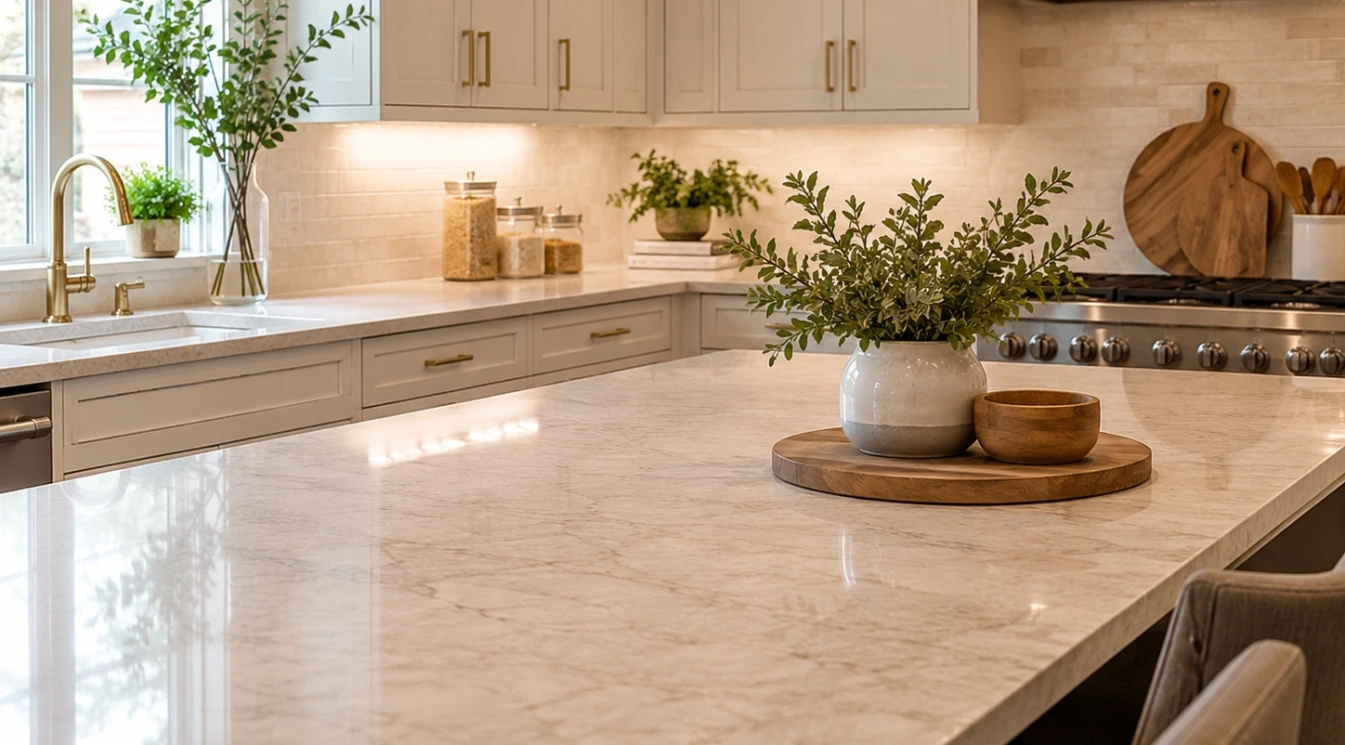
Warm neutral surfaces create a kitchen that feels refined, welcoming, and naturally connected
Why Warm Neutrals Feel More Inviting
Color temperature changes the emotional feel of a room. Cool whites and blue-based grays can look crisp and modern, but they may also feel sharp in a space with limited natural light. Warm neutrals soften that effect by introducing small amounts of yellow, beige, brown, or red beneath the main color.
The result does not need to look dark or traditional. A warm white countertop can still feel bright and clean. A pale beige quartz or lightly veined quartzite can create a relaxed, high-end appearance without drawing too much attention away from the cabinetry or architectural details.
Warm neutrals are especially useful in open-concept homes because they often transition more naturally into living rooms, dining areas, wood flooring, and upholstered furniture. Rather than making the kitchen feel like a separate white box, the countertop can help connect the surrounding spaces.
Warm White: Bright Without Feeling Stark
Warm white countertops are a strong choice for homeowners who want a light kitchen but do not want a cold or clinical appearance. Look for surfaces with an ivory, cream, or soft beige base rather than a bright blue-white background.
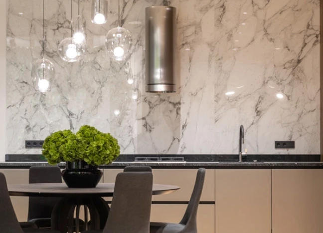
Some warm white quartz designs include delicate taupe or gold veining. Natural stones may show subtle minerals, clouding, or movement that gives the surface greater depth. These details can help hide minor crumbs and everyday marks better than a completely solid white surface.
Warm white works well with medium and dark wood cabinets because it creates contrast while preserving warmth. It can also pair with painted cabinets in cream, mushroom, sage, muted blue, or warm gray.
Cream and Beige: Soft, Natural and Easy to Coordinate
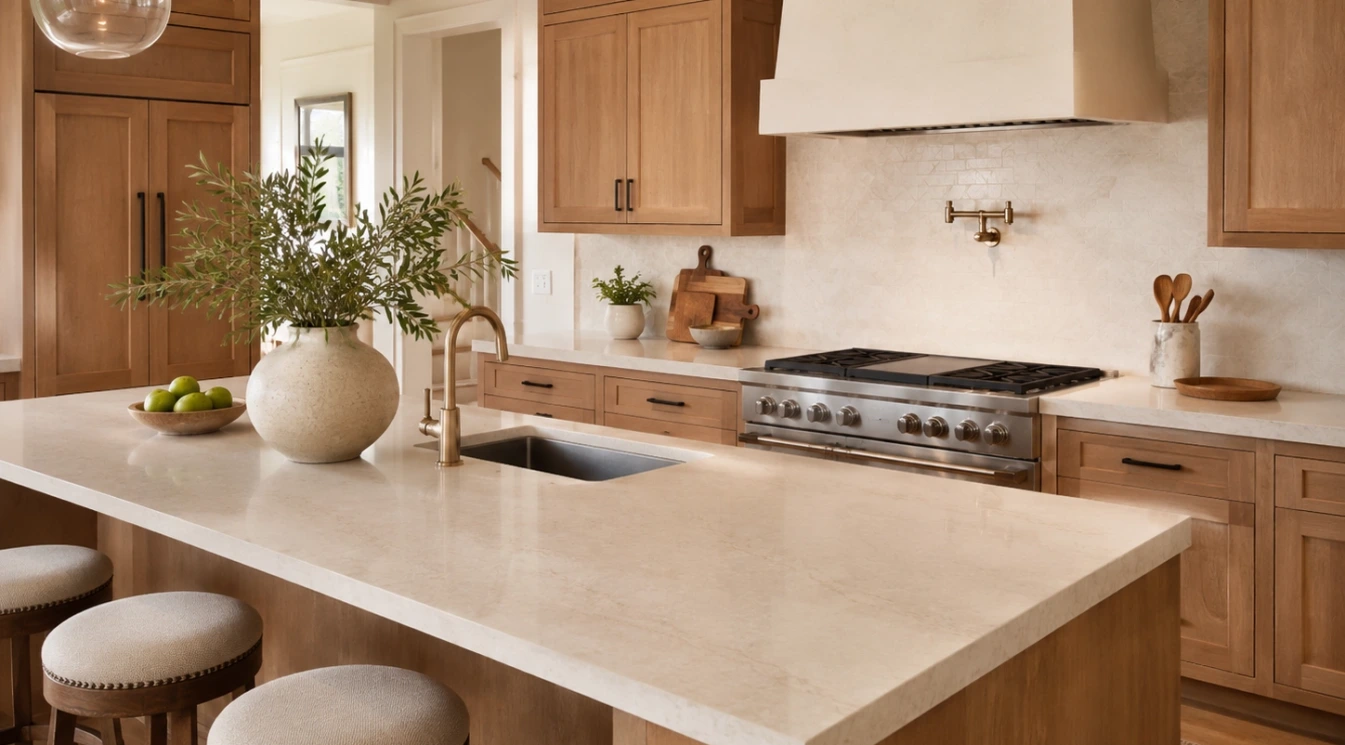
Cream and beige countertops can create a calm foundation for a kitchen. These colors often work particularly well with oak, walnut, alder, and other wood tones because they repeat some of the warmth already present in the cabinetry.
A pale beige surface does not have to look dated. The overall result depends on the pattern, finish, edge detail, backsplash, lighting, and cabinet style. A lightly textured or softly veined material can look modern when paired with simple cabinetry and clean hardware.
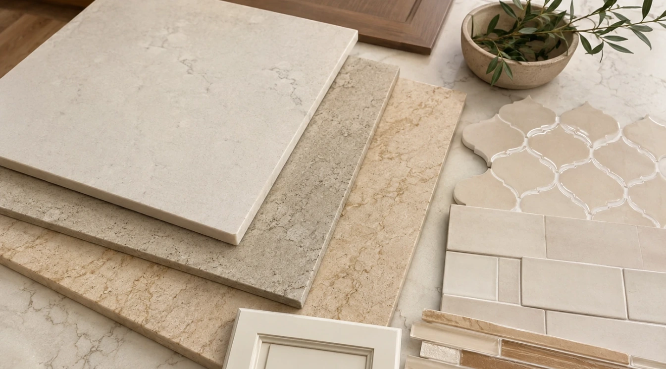
For a more layered room, combine a cream countertop with tile that has slight color variation rather than using an exact match. The small differences create depth and prevent the entire kitchen from blending into one uniform shade.
Taupe and Greige: Balanced Between Warm and Cool
Taupe and greige sit between beige and gray, making them useful when a home includes both warm and cool finishes. A taupe countertop may connect warm wood cabinets with stainless steel appliances, while a greige surface can soften cool gray cabinetry without creating a strong yellow cast.
These shades are often easier to live with than a highly saturated color because they change gently throughout the day. In morning light they may appear warmer, while evening or artificial lighting can bring out more gray or brown.
Always view a large sample in the actual room when possible. Small samples can hide movement and may not show how the undertone reacts to flooring, wall color, and cabinet finishes.
The most welcoming kitchens are not built from one perfect color. They are created by combining materials that feel naturally connected.
Choosing Veining That Supports the Color Palette
Veining can make a neutral countertop more expressive, but the vein color should support the rest of the room. Warm gray, taupe, beige, brown, or soft gold movement can connect the countertop to wood cabinets and warm metal finishes.
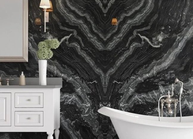
Bold veining creates a focal point and may work best when the backsplash, flooring, and cabinet doors are relatively quiet. Subtle movement is easier to coordinate when the room already includes patterned tile, visible wood grain, decorative cabinet doors, or several competing finishes.
With natural stone, every slab is different. A photograph or small sample cannot fully represent the final layout. Viewing the full slab allows you to see whether the warm areas, veins, and color transitions will land in attractive places across the island and perimeter counters.
Matching Warm Countertops with Cabinet Colors
Natural wood cabinets are an obvious partner for warm neutral countertops, but the undertones still need attention. Golden oak may pair well with cream, warm white, or a balanced greige. Walnut can look rich with ivory, taupe, or a pale stone containing soft brown movement.
White cabinets should not automatically be paired with the brightest white countertop available. A slightly warmer surface can add dimension and prevent the room from feeling overly uniform. The same principle applies to dark cabinets, where a cream or warm white countertop can create contrast without appearing harsh.
Green, blue, mushroom, and taupe painted cabinets can also work beautifully with warm surfaces. The safest approach is to compare the cabinet door and countertop sample together under the room lighting, then add the backsplash and flooring samples before making the final decision.
Do Not Forget the Flooring and Backsplash
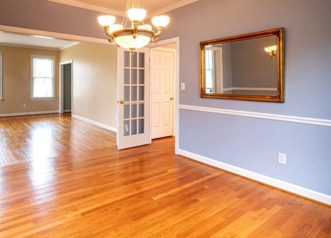
Countertops are only one part of the color story. Flooring often covers the largest visible area, so its undertone can influence whether a countertop feels coordinated or disconnected. Warm wood and wood-look flooring usually pair naturally with cream, beige, and taupe surfaces.
For the backsplash, consider whether the countertop should remain the quiet foundation or become the visual feature. A patterned countertop often benefits from a simpler tile. A calm countertop can support handmade-look ceramic tile, textured porcelain, mosaics, or a contrasting full-height backsplash.
Matching every surface exactly can make a room feel flat. A better approach is to repeat related undertones while allowing small differences in texture, shade, and pattern.
Lighting Can Change the Color More Than Expected
Natural light, cabinet lighting, pendant lights, and overhead fixtures can all change how a neutral surface appears. Warm bulbs may intensify cream and beige tones. Cooler bulbs can reduce warmth and make the same countertop look grayer.
Before approving a material, look at it during the day and after sunset. Place the sample horizontally because countertop color can appear different when the sample is held vertically. Also consider reflections from painted walls, nearby wood, and large windows.
Which Materials Offer Warm Neutral Options?
Quartz offers consistent color and predictable patterning, which can make coordination easier across a large kitchen. Quartzite, granite, marble, and other natural stones provide unique movement and mineral variation. Porcelain and other large-format surfaces may also offer warm stone-inspired designs for suitable applications.
No material should be selected by color alone. Maintenance, heat exposure, UV exposure, edge design, fabrication requirements, and everyday use should also influence the decision. A beautiful surface is most successful when it fits both the room and the household.
Bring the Complete Material Palette Together
When selecting countertops for a Sacramento kitchen remodel, bring cabinet doors, flooring samples, backsplash options, paint colors, and hardware finishes together before making a final commitment. Viewing the materials as one composition makes undertone conflicts easier to identify.
Domus Surfaces can help homeowners compare quartz, natural stone, tile, flooring, and other remodeling materials in one place. A coordinated selection process makes it easier to create a warm, inviting kitchen that still feels current and personal.